While reading a Hacker News thread about the U.S. State Department’s decision to change from Times New Roman to Calibri for official documents, one of the comments caught my attention. This comment had nothing to do with either Times New Roman or Calibri, but instead included the following link: https://nationalparktypeface.com/. National Park Typeface? That sounded intriguing. Moreover, I had spent some time earlier in the week adding fonts to my collection on my computer and e-reader. I decided to get to the bottom of the National Park Typeface matter.
Upon following the link, I was greeted by an aesthetic homepage with examples of the font.
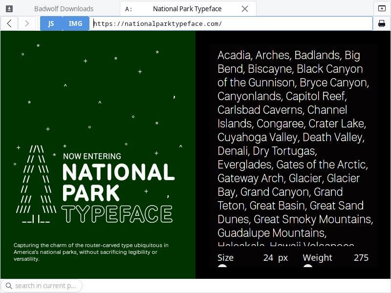
Sure enough, the font mimics the style of U.S. National Park signs. The site describes it as follows:
Capturing the charm of the router-carved type ubiquitous in America’s national parks, without sacrificing legibility or versatility.
National Park Typespace website
Scrolling down just a bit further gives us a preview of the eight styles for the font:

At the bottom of the page, we learn that the font is being developed by Ms. Andrea Herstowski, Mr. Ben Hoepner, and Mr. Jeremy Shellhorn.

The website also includes a section on the origin story of the typeface. The origin story concludes with a simple statement of purpose:
Our National Parks belong to the people, so this typeface should too.
Jeremy Shellhorn
While this font has a clear inspiration, it is not a mere novelty. It is clear from the previews that this is a nice, clean, and legible sans serif font. I would be half-inclined to try it for something at The New Leaf Journal had I not committed fully to a system font stack here. But while I am not using custom fonts on site, I can certainly test drive them on my computer to show readers. Fortunately, in accordance with the statement of purpose of the project in its origin story, the National Park Typeface is free to download and use. I downloaded the .otf National Park Typeface zip file (see download link):

How one will install it will vary from system to system. I run a Linux distribution called EndeavourOS, and I keep my user-added fonts in a .fonts directory inside my home directory. I extracted the National Park Typeface zip into my .fonts directory.
Now that I had installed the .otf fonds as user fonts on my system, I figured that I ought to give it a test drive. Note that this is by no means a comprehensive review and I do not count myself as a font expert. My intention is to give you an idea of what the fonts look like after installation.
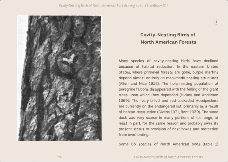
I am not in the market for a primary writing font. I use a monospaced font these days for most of my writing in Ghostwriter (currently Courier Prime). I am interested in how the font works for reading. But we should choose a fitting book to test it. In December 2021, I wrote an article about the saw-whet owl in which I relied heavily on a 1977 publication by the U.S. Department of Agriculture’s Forest Service called Cavity-Nesting Birds of North American Forests. This feels like the appropriate aesthetic. I downloaded the EPUB version of the book and added it to Calibre. But while Calibre is the best ebook manager, its built-in reader is a bit deficient on the aesthetics side. I want to give our National Park Typeface the best showing possible, so we are going to open the book in a Linux ebook reader called Foliate and test the font there.
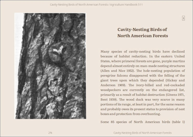
My default font in the above screenshot is Google’s Literata, a very nice free and open source serif font designed for electronic reading. Literata is one of my favorite reading fonts, but this is a book about parks and forests. It demands our new National Font Typeface. Rather than test all of the variations, I decided to take screenshots of the book with the regular, light, and medium versions of the typeface.
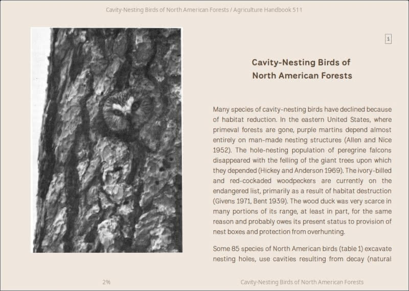
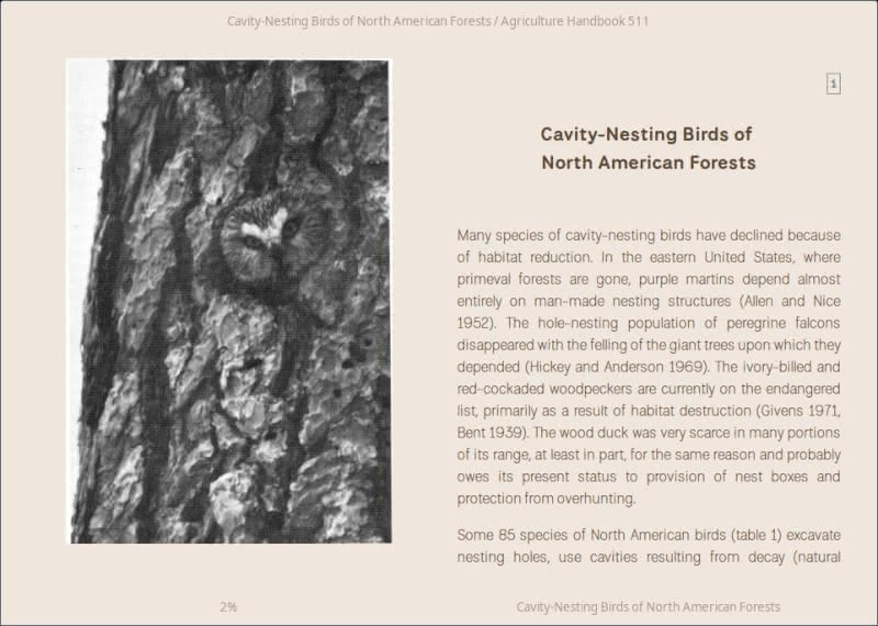
I tested regular, light, and medium National Park fonts above. I think the thinner light font works best for body text. In particular, note that the “s” characters look more balanced in small body text in the light version than they do in the heavier regular and medium varieties. I tend to favor serif fonts for ebooks, but the light version would be a credible sans serif choice. My quick impression is that for body text, the National Park Typeface is well-suited for short-to-medium length articles on the web. Its bolder flavors may be good title and header choices for certain aesthetics.
Because I thought the National Park Typeface may work well for articles, I decided to try it on an article. I used the free and open source Tranquility Reader extension for Firefox to open my saw-whet owl article and set the font to National Park Light.
That does look good. I could see a website making good use of National Park Light or Regular as body text.
If you want to add a dash of national park flavor to your book or project, the National Park Typeface is free to download in .ttf, .otf, and webfont flavors. The official website states that they are working on adding the font to Google Fonts, which will make it more readily accessible for many use-cases. I tip my hat to the team for their hard work turning the distinct style of the font used on National Park signs into a multi-purpose document, computer, and web font. The official website has a donation link if you want to support the project in that way.
(Note: Added link to origin story of the font with a short quote on the same day that I originally published the article.)