F-Droid is an alternative application repository for select free and open source Android apps. I subscribe to F-Droid’s blog RSS feed and regularly check in on the new apps to see if there is anything interesting. I recently became aware of what appears to be a relatively new game called Click Switch on F-Droid. After reading the description, I decided to install it and try it out for a small New Leaf Journal write-up.
Finding the Game
Click Switch is available on F-Droid and GitHub.
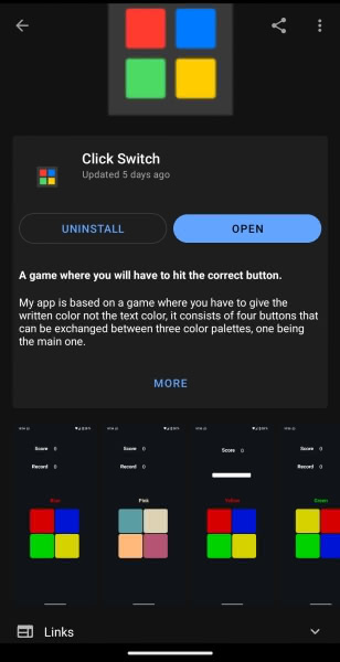
Click Switch is developed by GitHub user cuadratico and available under the MIT License. For those who do not use F-Droid, the app is available as a direct download from GitHub.
My Review Version and System
I initially installed and played version 8.6.6 (August 26, 2024) from F-Droid. I installed the version 8.7.6 update (September 6, 2024) and took some additional screenshots for my review. I did not notice any significant differences between the versions. I installed and played the game on a Google Pixel 3a XL phone running the DivestOS operating system.
Short Descriptuon
The F-Droid page for the game describes it as being “based on a game where you have to give the written color not the text color, it consists of four buttons that can be exchanged between three color palettes, one being the main one.”
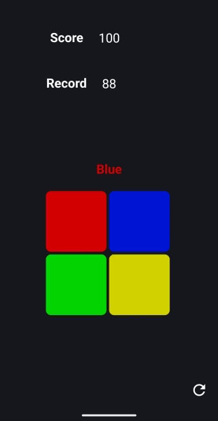
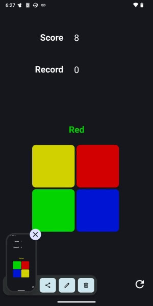
Having played it, I will provide a more succinct summary. You have a square divided into four smaller squares, with each smaller square being a different color. By default, the colors are red, blue, green, and yellow. Above the square, one of these four colors is written out. However, the letters spelling out the color will also be colored, and they will usually be a different color than the word. For example, we may have “Blue” colored green or “Yellow” colored red. The player is supposed to tap the square corresponding to the word instead of the color of the word. So if we have “blue” with the letters being colored green, the player is supposed to tap on the blue square.
If that was at all confusing, things should make more sense as we actually try the game.
Starting the Game
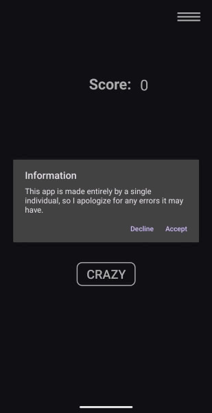
Upon first starting the game, the player is greeted by a small disclaimer from the developer, noting that the app is a one-person project that may have errors.
Of course – this is an entirely free and open source little game, so no apologies are needed. In fact, I will offer some (I hope to be) constructive feedback in this review.
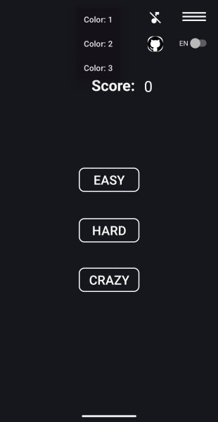
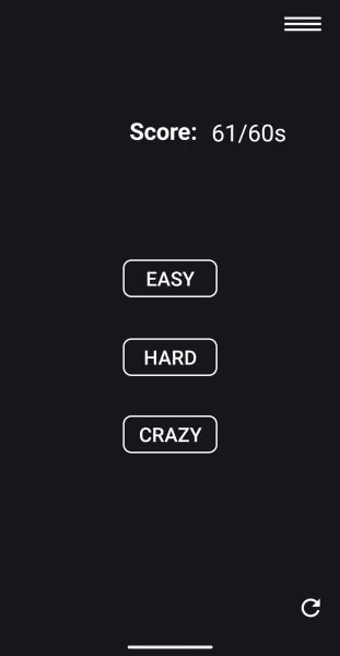
After accepting the disclaimer, we are taken to a very minimalistic title screen. There are three game modes: Easy, Hard, and Crazy. There is a small hamburger menu in the top right of the frame which has options for Color, Sound (off by default), language (English or Spanish), and a link to the game’s GitHub repository.
I will return to the colors and sound at the end of the review.
Easy Mode
For now, let us start with Easy mode. The developer describes Easy as follows:
In this mode you will only have to hit the correct button, if you hit it correctly you will get a point and if you don’t hit it correctly and your score is higher than your previous record you will have a new [record].
In short, on easy mode you have four colored squares and the colored squares do not move or change. Your job is to hit the square that corresponds to the written word for the color (not the color of the written word for the color) and to see how many times you can tap the correct square before making a mistake.
For example, in the below screenshot, I need to click the Green square because the word above the square is Green. I have to ignore the fact that the letters making up “Green” are yellow.
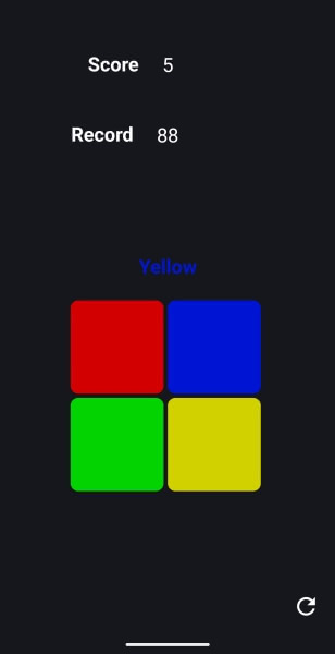
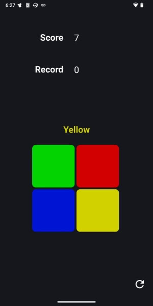
Whereas here in the same game, I have to hit yellow, notwithstanding that the word “Yellow” is colored blue.
As you can see in the above screenshots, your current score is listed along with your best score. One interesting point is that the new record is not recorded until after the current game is over. For example, you will see below that I beat my previous record but the new record will not be recorded until my game is over.
Easy mode is very straightforward. One thing that surprised me was the lack of a timer. This means that the player can take as long as he or she wants to choose a square with it having no effect on his or her ability to proceed in the game or the final score.
Hard Mode
Having tried Easy mode, I moved on to Hard. The developer described Hard as follows:
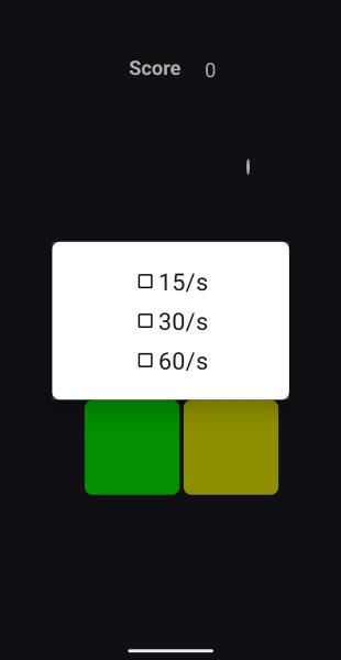
The hard mode is the same as the easy mode with the difference that you will have a Dialog to choose the amount of time you want between 15, 30 and 60 seconds.
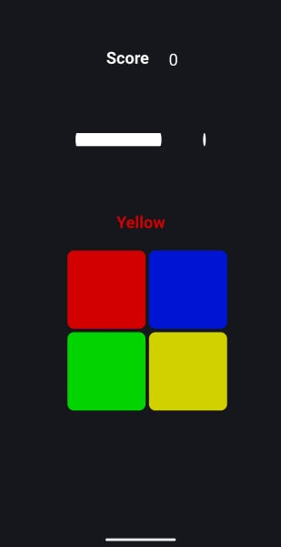
Hard is exactly the same as Easy mode save for its timer. The timer is represented by a bar above the playing field which ticks down until it expires.
One minor issue I ran into is how scoring records are recorded in Hard. After finishing a game, it usually shows your most recent record.
But it seemed to struggle with finding my record if I switched to a different time span (e.g., trying 30 seconds after 15).
Crazy Mode
Finally, let us look at Crazy mode. The developer describes Crazy as follows:
This mode is the same as the easy mode but the order of the buttons varies randomly each time you score a point.
I will show rather than tell here. See the square on one point.
Then after I made the correct choice in the above frame.
Interestingly, crazy mode does away with the timer from Hard. The gimmick is that the squares shift every time you make a correct choice. But like Easy, there is no benefit to playing fast or penalty for playing slow.
Colors and Sound
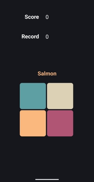
I noted that there are three sets of color options. All of the above screenshots were of the default color one scheme. See scheme 2:
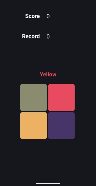
Then scheme 3:
The pallets are a matter of preference. In theory, it may be the case that the second and third color schemes are supposed to be more difficult because the colors are less sharply distinguishable than the default configuration, but I personally did not think it made a big difference.
Sounds are off by default. I tried turning them on. They add a small clicking sound as feedback for touching a square, but that is the sole sound effect.
Ideas for Improving the Game
I enjoyed testing Click Switch and I think it has a fun concept. The actual action – trying to choose the correct square – works well. There is plenty of room for improvements in the game modes and record keeping.
Regarding the game modes – I do not think that the current Easy, Hard, and Crazy levels make sense. While Easy is the most basic experience, it is not clear to me that Crazy is “harder” than Hard. While Crazy does have the color-swapping mechanic, its difficulty is offset by the lack of timer. If one is going for a high score, Hard is harder than Crazy solely by virtue of being timed.
Instead of opening with asking the player to choose between one of three vaguely-defined difficulty levels, I would begin with asking the player to choose between modes: Marathon and Against the Clock. In Marathon mode, the game continues until the player makes a mistake (similar to Easy and Crazy in the current build). In Against the Clock mode, the player would try to choose as many correct squares as possible within a time limit, like the current Hard mode. In order to make the Clock mode more distinguishable, I would not have the game end if the player makes a mistake – instead, I think the player should be assessed a penalty – for example losing three points (with a point awarded for each correct square choice).
After choosing between Marathon and Against the Clock, the player should then choose between Stable Colors or Color Swapping (I am sure someone can name them better). Stable Colors would work in the same way that Easy and Hard do in the current game where the four tappable squares do not move around. Color Swapping would use the current Crazy mechanic.
These choices would be sufficient for the Against the Clock game. For Marathon mode, I would have one additional prompt. I think there should be a time limit for choices in marathon mode. Not having one makes the game too easy and demands that the player make the challenge him or herself. I would offer four options: Something like no timer, 10 seconds per move, 5 seconds per move, and 3 seconds per move. People could still choose to play with no timer (like how it works now), but others can work with a per-move time limit. Whether 10/5/3 makes sense would require testing – that is just a starting suggestion to illustrate the concept. I do not think a per-move timer is necessary in Against the Clock games since the clock would effectively penalize slow play, but it is possible it should be an option there too in light of my idea that wrong choices should result in a points penalty.
Finally, the game should have a best score section that keeps track of the player’s best scores in each game. One additional idea would be to allow the player to enter a name (a la old arcade games) – which could be a fun way to allow more than one person to play on the same system.
Conclusion
I enjoyed trying Click Switch and the actual clicking game seems to work very well from my testing. The fundamentals are there. The game modes can be improved and I humbly submit that my suggestions may be a good starting point. I will keep it installed and check out later versions to see how the project develops over time. I tip my hat to cuadratico for the fun addition to open source gaming on Android.
