The Girl I Like Forgot Her Glasses is one of the many new anime series airing in the summer 2023 season. Back when I read the series announcement in April, I wrote a short Leaflet asking whether the gimmick for this series, which is a middle school romantic comedy, is too specific. (Note I do not oppose the genre on principle; the third season of Teasing Master Takgai-san is my reigning anime series of the year.) The first episode of The Girl I Like Forgot Her Glasses generated discussion for an unexpected reason (unexpected to me at least): Its animation. The genre is not generally characterized by ambitious animation. The Girl I Like Forgot Her Glasses is, for better or worse, not short on ambitious animation. I found the discussion interesting because the debate was precisely centered on whether the ambition was for better or for worse.
(Note: All of my screenshots come from Crunchyroll and are unedited other than minor compression. There are links to video clips later in the article which will give you a better idea of what the animation looks like in practice.)
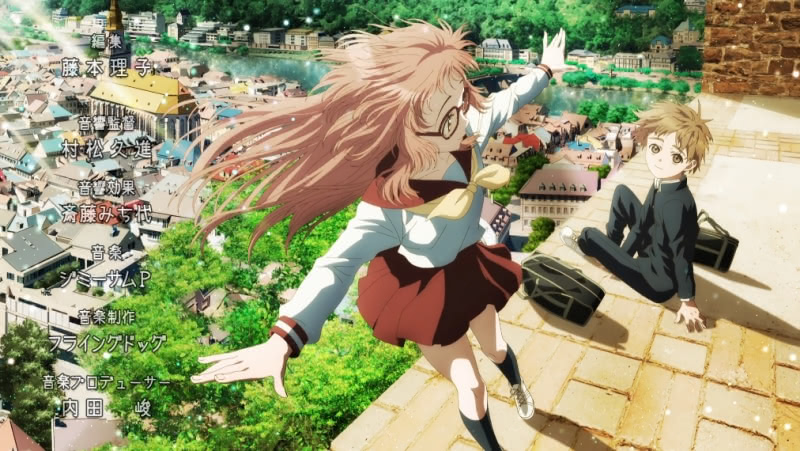
Before getting into the weeds, allow me a few prefatory notes. Firstly, while I watch plenty of anime, I do not partake in anime communities. Much like with Mario Party in the olden days, I watch anime on my own. However, I do read some anime blogs and websites which give me some view into the broader anime communities stateside and in Japan. I read about the first episode of The Girl I Like Forgot Her Glasses before I actually watched it, so I will endeavor to present the story as I learned about it from my perspective, examining the issues before offering my own opinions.
The elephant in the room in this entire discussion is GoHands, the Osaka-based anime studio responsible for The Girl I Like Forgot Her Glasses. It was through reading about the anime series’ first episode that I learned both that GoHands has a very distinct “house style” and that its house style has been the subject of passionate feelings, often falling on the negative side. I was not familiar with GoHands and its reputation because I had never seen any of the small number of anime series the studio was principally responsible for. This was not out of any desire to avoid GoHands, but instead because it must have been the case that none of them interested me enough to prompt me to try. Thus, I go into my survey without having had any opinions about the studio.
(GoHands note: I saw the opening scene of GoHands’ third produced anime, Seitokai Yakuindomo (2010), when a friend sent it to me many years ago. It is certainly unique for its interesting CG work, questionable topics of discussion, and what may have been the worse English I heard in anime, which is saying something. But I did not watch the series. I recall K, which debuted in 2012, was heavily promoted on anime sites I read at the time, but I never ended up watching it.)
Introducing the Debate
The first episode of The Girl I Like Forgot Her Glasses aired on July 4, 2023. Two days later, an article in India’s Hindustan Times (apparently a source of anime news) summarized the debate about the episode:
Fans have reacted to the unusual cinematography with polarising views. While some absolutely love it and find it refreshing, others find it jarring and nauseating. The production includes many long-angle camera shots and slow-motion scenes along with bright and vibrant designs.
As we will see, this is not at all inaccurate. If anything, it undersold some of the negative takes I had. It also may have undersold “unusual cinematography” and “long-angle camera shots.”
Tenka Seiha’s (qualified) positive take on animation
I follow an anime blog called Tenka Seiha. While I only discovered the blog recently, it has been active since 2007. The webmaster at Tenka Seiha, Aroduc, will generally review the first episodes of every new (as in non-sequel) series of a new season and offer what are generally negative impressions, expressing dismay at the state of the anime industry in humorous fashion. I agree with Aroduc on many issues (e.g., too much isekai, excessive yelling by anime characters is bad) and disagree on others (general taste), but the reviews are always entertaining and the blog comes with my recommendation.
I have read enough of the blog to know that The Girl I Like Forgot Her Glasses was not the type of series that would be popular with this webmaster. I read his episode 1 review when it was published on July 4.
See Tenka Seiha’s Episode 1 Review.
While his overall impression of the episode was about what I would have expected given the premise, I was surprised to see praise for the… animation? I quote from the review.
This show, however, almost makes me sad for the artists and animators that died to put together the first three minutes. There were more frames of animation, better incorporated CGI, more visual direction than possible every single other new show I’ve watched for the summer season so far, put together.
That is some high praise – if not for the actual content of the series. Aroduc somewhat tempered the praise with notes on the execution:
Which isn’t to say that it’s all necessarily good. It still has GoHands usual bloom and glare all over the place, all the weird-[] camera angles designed almost solely to mess around with perspective.
(Mildly censored for family website reasons.)
That is, while the review was impressed with all the work that went into the animation of the first episode of The Girl I Like Forgot Her Glasses, it noted some issues with lighting effects and unusual camera angles for the sake of unusual camera angles. But the review then returned to the technical feats:
Teenagers in animation sweatshops worked 20 hour days to animate every single strand of this girl’s hair settling when she bobs her head for this show.
The girl is the forgetful heroine of the series, Ai Mie. The incredibly detailed animation of her hair will be a theme throughout this article. (Sadly, there is no commentary about her brown hair color. But if the series ever decides to get into hair color, you can rest assured that the leading anime hair color anthropologist will be on the case.)
Aroduc led the review with some praise for GoHands as a studio:
Someday, GoHands will stumble into a huge license, or manage to find some undiscovered genius of a writer and will put together a masterpiece.
I was intrigued by this review. While I was (and full disclosure, remain) skeptical about the series on account of its very gimmicky set-up, this description of the animation was very interesting. It is the type of series I will at least try an episode or two of. Now I wanted to see the animation. But before I could see the animation, I came across a series of much more negative reviews.
Negative reviews from Anime News Network and Random Curiosity
I do not rely on anime reviews to decide what anime to watch. I have my own opinions on what makes a series good, worth watching, or at least pleasant. But there are many new anime series each season and unlike Aroduc of Tenka Seiha and some other similarly brave reviewers, I am not inclined to watch every debut or 2-3 episodes of all the new series (perhaps I would if mine were an anime blog instead of a general writing project). Thus, I use reviews of the beginning of series to help me target specific series to try and, with hope, follow in the new season. Two of these blogs are Anime News Network’s running list of reviews of the first episodes of new anime streaming and Random Curiosity, a site which does detailed episode reviews with many (I emphasize many) screenshots.
I read Anime News Network’s review of The Girl I Met Forgot Her Glasses after reading Tenka Seiha’s. While I generally do not put much stock in their review scores, the first episode reviews are a good way to get an idea of what is airing. Five reviewers took on the first episode of The Girl I Like Forgot Her Glasses, and their takes were very different than Tenka Seiha’s.
See Anime News Network episode 1 reviews.
Ms. Caitlin Moore gave the first episode 2.5 stars out of 5. But she gave it this score in spite of the animation:
The opening minutes of The Girl I Like Forgot Her Glasses will undoubtedly live in infamy. The camera follows the main character, Kaede, in a swooping, low-angle tracking shot as he enters the school and monologues in his head about the girl he has a crush on. It is like a POV shot of some kind of small animal, say a cat or frog, that has somehow ended up trapped in the school and is trying to avoid being stepped on but can’t seem to escape being underfoot. The color scheme has a strange tint that shifts from warm browns to cool blues and purples, often with a random gradient in the corners.
Contrast with Tenka Seiha, which praised GoHands for the effort that went into these opening minutes (while granting some of the issues with lighting and camera angles noted by Ms. Moore). Ms. Moore did opine that the camera “calms down a bit” after the opening minutes, but criticized the animation for making “[t]he characters … look like they exist on a different plane … from the backgrounds.”
Next we have Mr. James Beckett, who gave the first episode a score of “GoHands Must Be Stopped” out of 5:
From the first shot of the episode, I could barely concentrate on what any of the characters were saying or doing because my brain refused to ignore all the different and incredible ways that The Girl I Like Forgot Her Glasses screw up even the most basic principles of visual storytelling.
Ms. Rebecca Silverman gave the first episode a 1:
Until I watched this episode, I didn’t realize that it was possible to be both bored and motion sick simultaneously. Thanks, GoHands, for teaching me that very important lesson.
This is dark. She appears to agree with the Tenka Seiha review regarding the story while disagreeing fully regarding the animation. However, Ms. Silverman did credit the episode (faintly) for certain animation flourishes:
When all of this nothing is combined with the artistic stylings of GoHands, the result is an unholy combination of stultifying and nausea-inducing. There are a few elements of the art and animation that I don’t hate – Mie’s lava lamp eyes are kind of pretty, and I like the way her hair moves – but these pale in comparison to the less good choices.
Mr. Nicholas Dupree gave the first episode “1 big, blurry ‘E’ at the top of the optometrist’s chart” out of 5:
For years, Studio GoHands has had a well-earned reputation as the punching bag of the anime industry. There’s, of course, the lingering plagiarism scandal that has kept their Tokyo Babylon anime reboot shelved for years; however, they’re mostly known for making shows that look like reheated garbage in a very specific way.
(I had not previously familiar with the Tokyo Babylon plagiarism scandal. I will not cover it here because it is not relevant to the subject of this article, you can read about it here if you are interested.)
Mr. Dupree appears to have agreed with Aroduc’s observation about the effort that went into the episode, but he disagreed strongly with the result:
It’s that combo of high effort and visible deficient results that makes GoHands productions a kind of train wreck experience, and it’s only heightened here as they adapt someone else’s work without adjusting their style at all. These overly complex sequences still exist where the simulated camera swoops around the room and characters. At the same time, the hand-drawn assets try in vain to stay recognizable and move roughly at the same frame rate as the CG backgrounds. We still have sickly yellow and blue filters trying desperately to make the various digital effects look like they exist in the same universe.
Mr. Dupree also faulted GoHands for applying its dramatic animation style to a very subdued series which is “not the kind of show that calls for any of this.”
Before watching the episode for myself, I also read Princess Usagi’s review at Random Curiosity.
See Random Curiosity’s Episode 1 Review (Note this review has many high quality screenshots).
Princess Usagi had a similarly negative predisposition against GoHands’ house style as the five Anime News Network reviewers, and had a similarly negative view of the first episode of The Girl I Like Forgot Her Glasses:
I wasn’t going into this with high expectations, purely because of the studio, GoHands, but even so, it still managed to dance the limbo beneath that low bar. I think Mie (Wakayama Shion) wasn’t the only one who forgot her glasses- seriously- what was with those strange angles– it made Komura (Itou Masahiro) look like he was Gumby or something? I have a fairly strong stomach, but those panned shots moved all over the place so horribly, even I felt like I was going to get motion sickness. And what was the point of wasting screen time with random shots (rhetorical question really- budget is probably the answer).
Princess Usagi also noted the very detailed hair animation before segueing into opining that the animation style did not match the content of the first episode:
There was so much posturing and hair blowing, I couldn’t tell if it was an anime adaptation or a shampoo/perfume commercial at some points. The manga’s focus was on the situational comedy between the two – any posturing was natural and didn’t distract from what was happening. Unlike this hot mess of an adaptation where it stuck out like a sore thumb, distracting from the situation itself.
However, a couple of commenters on Princess Usagi’s review showed that the Tenka Seiha review did not stand alone. I quote commenter ruicarlov:
I know those scenes are a kind of weird choice, but I still don’t quite understand all the hate, really. I suppose I have a high tolerance for GoHands ‘exotic’ tendencies and I do respect the effort they put into getting a lot of things moving on screen…
Commenter ruicarlov also enjoyed the episode (as did Princess Usagi at points, save for the distaste for the visual aesthetics). Commenter Zemo x2 seems to have agreed fully with the Tenka Seiha take.
Other takes, good and bad
I watched the first episode of The Girl I Like Forgot Her Glasses between reading the Random Curiosity first episode review and reading the reviews I will cite to below. I note this only to be clear to the extent that I have been telling the story in chronological order prior to this section.
Beneath the Tangles is a blog which discusses anime from a Christian perspective. While that is an unconventional approach, it produces some interesting content – including an insightful take I cited to in my review of Endo and Kobayashi Live. One of its reviewers, Mr. Josh, tacked the first episode.
See Beneath the Tangles’ Episode 1 Review.
I’ve never seen anything like it…for better or worse. I never saw the trailer for this one, and I’m really glad I didn’t because it allowed me to experience this firsthand. I’m very impressed with the work done on this one. The tracking shots, the camera angles, the movement of the hair, the sparkling in the eyes…all of it just looks great.
However, Mr. Josh qualified the praise with a critique of occasional show-boating:
Did we really need that one long tracking shot of Kaede walking up the stairs? Did we really need every single strand of hair animated? No, we really didn’t.
Let us contrast this with a very interesting negative take from Guardian Enzo of Lost in Anime.
See Guardian Enzo’s Episode 1 Review.
This review is interesting because Guardian Enzo is apparently a fan of the manga on which The Girl I Lost Forgot Her Glasses is based. We see his disappointment with the production:
Don’t get me wrong – when this was bad, it was really biblical. Those first five minutes were beyond the pale, some of the weirdest, most misguided, and ugly animation I’ve ever seen. But after that it was almost- well, I won’t say “normal”, but it could almost have passed for real anime.
He went a bit further on the opening sequence:
I mean, is it really possible someone to look at that freakshow of an opening sequence and not realize it’s a crime against humanity?
(As we have already seen – indeed it is possible!)
He expressed disappointment due to appreciation of the source material:
Again, this is all happening with a manga I really, really like a lot.
Guardian Enzo encourages people to keep watching, assuring us that the actual material covered by the manga is very good (and hoping GoHands calms down a bit). I will note I am a bit skeptical that there is a there there, but I suppose it is cause for some optimism to see the perspective of a manga reader who is assuring is that there is much more to the series than what one may expect from the premise.
The series is airing on Crunchyroll. I seldom read comments under the video, but I was interested in this case since I decided to write a whole article about differing takes on the animation. The Crunchyroll comments were as mixed as the reviews we have read thus far.
See Crunchyroll comments below video.
You will find every possible view in the Crunchyroll comments, from commenter willbert0 praising the camera work (which is unusual even in generally positive takes) to commenter streamerword describing the overall composition as “especially egregious.”
I also checked in on a forum thread at My Anime List, which had a topic devoted to debating the animation.
The thread was started by commenter suhareuh, who liked the animation:
I thought it was really cool and unique considering it’s a romance anime. The details are phenomenal and the camera angles really kept me hooked while watching. You can tell they went all out for the show which is a breath of fresh air for the genre considering a lot of romance anime’s have poor-decentish animation.
In addition to the unusual praise for the camera angles, this comment gets at a point I noted at the start — that ambitious animation direction is not a staple of the middle school romance genre. The thread saw several positive and negative takes. I will quote a strong negative perspective from commenter MarchinBunny:
Guess I am an odd one out here. I hated it. It’s so unnecessary and to me it doesn’t even look good as the animations often looks very stiff and janky when they do it. Plus, they are overusing extreme angles for no reason. Usually things like that are done to set the tone for a scene, but here … it’s like they just learned how to do it, and got overly excited about it and just used it everywhere, or like they are trying to show off or something.
My animation assessment of the first episode
Not content to rely solely on what other people thought about the first episode of The Girl I Like Forgot Her Glasses, I watched it myself. On the whole, my assessment of the aesthetics is closer to the Tenka Seiha view than the very negative reviews on the other review sites. However, I will grant to a greater extent than did the Tenka Seiha review, which was more negatively disinclined toward the premise of the show, that there were some tonal clashes between the animation and the content. I think some of the very negative reviews came with general baggage regarding GoHands’ previous productions, baggage that I (apparently mercifully?) am not saddled with.

In terms of animation, the first episode of The Girl I Like Forgot Her Glasses comes in two parts. The first part is the first 3 minutes and 8 seconds. The second part is the rest of the episode, which runs for 23 minutes and 40 seconds on Crunchyroll. While some of the negative reviews targeted sections outside the first 3 minutes, much of the commentary – especially pertaining to camera angles and alleged motion sickness, were related to the opening sequence. One point we will examine that exists mostly outside of the 3 minutes is the impressively (or excessively) detailed animation of Ai Mie’s hair.
In terms of evaluating the prospects for the series going forward, I find the opening 3 minute stretch to be less significant than the episode proper in light of the fact that the latter 21 minutes and change of the episode are more likely than the opening sequence to offer an idea of what is in store for the project. But since some viewers found the first three minutes either remarkably refreshing or incomparably off-putting I will tackle it first.
The opening three minutes
The first three minutes are not short on ambition, but the execution is, to put it mildly, mixed. I more than grant the complaints that there are instances of GoHands doing things simply because it could (not because it should) and some botched execution.
To begin, let us review a video of the first 43 seconds, which was posted to the excellent Sakugabooru site (its companion blog, Sakugablog, has expert analysis of animation in anime from an industry perspective, well beyond what I am capable of providing):
I agree broadly with commenter Andy’s assessment on the scene, which you can watch by following one of the links above. Mr. Andy examined each of the seven cuts which make up the first 43 seconds, and found that cuts 1-2 and 4-6 were good, while cuts 3 and 7 were bad.
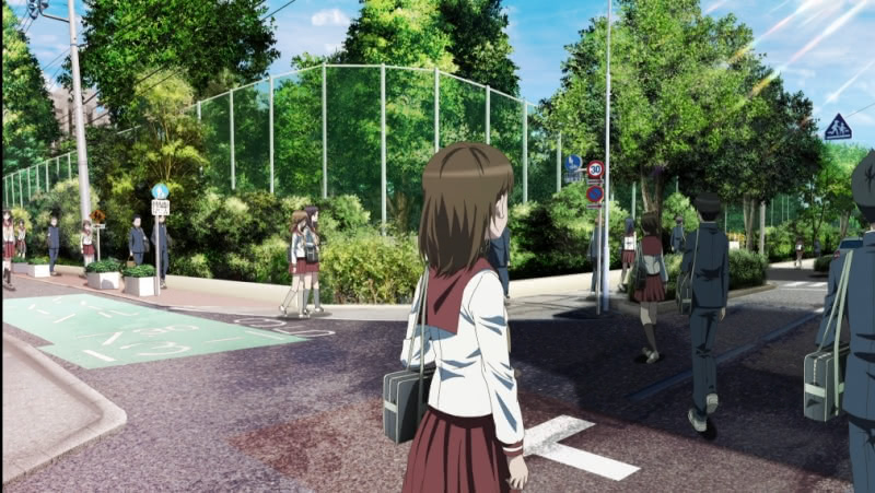
Cut one features the male protagonist of the series, Kaede Komura, walking down a sidewalk among several other students from his school. The camera swings slowly from the street to the sidewalk, and it takes a sort of panoramic perspective which is, to be sure, unusual. But the quality is solid and the effect is interesting. Cut two has the camera looking straight down the sidewalk, with Kaede in the center. The view is less distorted, but there are heavy lighting effects. Here, I will note two positive themes in GoHands’ work on the first episode generally. The characters are well animated, move naturally, and in this case are part of the environment. Moreover, the attention to detail is impressive. If you watch closely, all of the background characters are doing something – which adds life to the scene.
Cut three takes us behind Kaede at street level. The angle is odd – it makes his legs look absurdly long. I agree this section is not well done, perhaps an example of GoHands trying to do something because it can, but not actually being able to pull off what it was trying to accomplish. One thing that bothers me with respect to cut three is Kaede’s shoes. The shoes in first two (and next) cuts look natural – feet flex properly, the shoes connect with the ground. In this odd cut, however, Kaede’s shoes look boxy – perhaps like something out of a mid-90s 3D video game for the PlayStation 1 or Sega Saturn.
Cut four returns us to a more normal sidewalk level view, looking at passers-by horizontally while facing an alley. If you look at how the shoes connect with the ground here, you can see how much better it is than the odd cut three. I agree this scene looks nice, although one critique I have that also features in other cuts is that the shadows of the people look unnatural – there is something off about them. For a studio which is clearly very interested in lighting, the people shadows are unconvincing and thus disappointing. This defect continues to cut five, where we take the view of something sitting on a stop light. It is not too distorted, the people move well, but the shadows of people are a little off. The building on the left side of the scene looks a bit oddly flat, an example of mixed-quality CG in the series. Cut six puts the camera right in front of Kaede. The lighting is a bit too heavy here, but it is not as bad as some of the negative reviews would have you believe. I will also note some of the buildings are unnaturally blocky, but that issue shows itself more on close inspection than when watching normally. I again praise GoHands for attention to detail with respect to characters in the background being full of life.
Cut seven returns to that weird perspective tracking Kaede’s feet, making his legs look absurdly long. I will note his shoes look better in cut seven than in the similarly bad cut 3. We segue into his dream sequence as the screen is filled with somewhat poorly designed 3D sakura petals and pink bubbles.
Thus, the first 43-second showboating sequence is a mixed bag. Parts of it were genuinely excellent and well-animated, and far more attention-grabbing than your average anime, even some which ought to have more animation flair. But two of the cuts were genuinely awful (the two identified by Mr. Andy), and when applying close scrutiny, one can pick out instances where objects (the last car in cut 1, the building main in cut 5) are not quite rendered accurately . The detail on background characters is wonderful, but the handling of character shadows is mediocre.
I noted that cut seven ended with a deluge of CG cherry blossoms and pink bubbles of somewhat questionable quality. That brought us to the next 27-second sequence:
No one posted an analysis here, so you will have to make do with mine alone. Following Mr. Andy’s guidance, I see broadly four cuts here. The first transitions from cut seven if the previous set – after the scene is covered by the CG sakura petals and pink bubbles of Kaede’s imagination, we have a close-up of the torso of a smiling Ai Mie and her remarkably-well animated hair (the half-joking comments about every strand of hair being animated are only slight exaggerations). Although we do not see Ai’s legs, the sense of movement in the scene gives the impression that she is skipping (mind this is Kaede’s imagination). Because we are told that Kaede is in love with her, the purpose of this scene should be to show us how she looks through his eyes. It does this effectively and is well-animated.
Cut two is long and a bit odd. The CG petals take over again and we have Ai, who puts his hands behind his back and takes a breath as the city background gives way to a clear blue sky with Kaede floating somewhere between the ocean and the sky as he throws his arms out and closes his eyes. White birds fly by among many CG sparkles (now blueish-green instead of pink) as the camera swoops around Kaede. This scene is not only odd, but if you look closely there are some technical issues. Take note of the horizon when the transition occurs, and the camera perspective as it swirls around Kaede while birds and sparkles fly around makes it a bit hard to decide where I am supposed to focus, assuming there is a focal point. This transitions away from Kaede to the white birds flying off into the clouds – the bird-cut three is fine but I am not quite sure what the purpose is.
The bird cut three transitions to what I assume was probably intended to be the defining cut of the open sequence. We see Mie, with her back to the camera, standing in front of a fence on a cobblestone street looking across at pretty houses in the distance. This cut brings together the good and bad of episode 1. The camera rapidly zooms in on Ai Mie, who turns to face the camera for a close-up to end the cut. Again, in light of the fact that this is the Mie who Kaede fell in love with, the scene should be striking to show the viewer what she looks like to Kaede. Mie’s face, eyes, and hair are excellently animated, she fits in with the environment, and there’s a real sense of physicality to the scene with how the wind is swirling around Mie. The backgrounds are also quite pretty.However, as the camera zooms in on Mie, just before the scene can be saved by the closeup, the cobble stones lose their definition and turn from clearly defined stones in a path to a blank gray slate (pun intended).

If only the camera had made it to Mie for her close up one moment sooner!
Kaede’s reverie segues into scenes with him walking alongside Ai Mie (all in his imagination, presumably). There are two cuts, one of them together and a second with Mie looking at the camera, presumably from Kaede’s perspective.
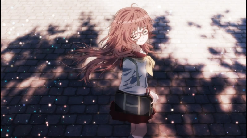
These are generally well done – and are followed by a couple of still shots of Kaede and Ai, including one where the only thing moving is their hair. We then return to Mie walking along the street with Kaede running to catch up to her, only to have his dream broken when a truck drives by as he reaches the corner. Again, this sequence is well done save for one odd camera swing.
It is after Kaede’s dream ends that we have one unforgivable stretch of animation – and one which gave critics of the production plenty of ammunition. The bad sequence begins with Kaede making the final walk to school and includes some questionable (to put it mildly) use of camera distortions. See the following abomination:
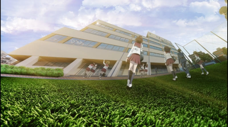
That was followed by an awkward 58-second sequence of Kaede entering the school building, walking up the stairs and down the hallway into his classroom, while having Ai Mie run by him before he made it in (no longer his dream).
This 58-second stretch represents the worst of the episode – poorly integrated 3D elements, bizarre camera angles and swings, sharp edges, an animation error noted in the comments (see 50-51 seconds), and perhaps a general lack of rendering. I get the impression here that GoHands ran out of time to execute what it was attempting here, separate and apart from whether it should have been attempted at all. Ambition counts for little of the effect is poor, and there is not positive I can say about this stretch. But I will praise two points. First, there’s a tiny sequence beginning at about 6 seconds and concluding with a camera swoop at 8 where Kaede is walking down the hallway as a random girl at the school almost bumps into him. Then at 21-22 seconds as Kaede is going up the stairs (after some unfortunate camera distortions), a girl running down the stairs is animated very well. Both snippets evince that GoHands continued to pay attention to background characters. But the overall effect of this sequence is very poor and likely poisoned the episode for some viewers.
Note regarding dizziness
I saw many complaints about the camera work making viewers dizzy. Some of the complaints appear to have been specious, but as you can see in my selected quotes in the earlier sections, some viewers appear to have genuinely experienced nausea.
I have noted in previous articles that I have significant issues with vertigo and motion sickness, such that I avoid cars and boats whenever practicable, and I was once taken out by a very short tram ride from Roosevelt Island to Manhattan. In fact, I cannot play most first person video games – especially shooters – without being crippled by dizziness.
(The original Pokémon Snap is alright, however.)
I did not experience dizziness from watching the first episode of The Girl I Like Forgot Her Glasses. While the camera was unfortunately swoopy in a few instances – mostly limited to the first 3 minutes – it fell well short of the sort of sustained motion abuse (see any first-person shooter video game) that would cause me to become dizzy. While mileage may vary, take it from someone whose video game choices are limited by low tolerance for first person perspectives that The Girl I Like Forgot Her Glasses could be much worse.
The normal part of the episode
Things calmed down a bit after the opening 3 minute sequence, which was probably something close to 50/50 in terms of well-done sequences and cuts on one hand and some abominations on the other. As most of the negative reviewers noted, GoHands behaved more normally in the rest of the episode.
Taken as a whole, I largely enjoyed the animation in the rest of the episode – especially to the extent it focused on Kaede and Ai Mie. While the purpose of this article is not to review the content of the episode, I will note that the running joke (as it is) is that Mie has little sense of personal space when she cannot see, and without her glasses she needs to share a text book and notes with Kaede. This is not a good thing for Kaede’s heart. For the best example from the episode, see the below 34-second sequence posted to Sakugabooro:
One can see what is happening without dialogue. Ai Mie, who is extremely nearsighted, asks to share a text book with Kaede. Kaede recoils in cut one, not because he dislikes the idea in principle, but because he feels awkward about being close to the girl he likes. Instead, he offers his book to Mie – cut two shows only his shaking hand holding the book as it flaps in the air. Cut three is the finest of the episode and perhaps one of the best in 2023. Mie, who sees no reason to take Kaede’s book for herself and likely cannot see Kaede’s embarrassment (being nearsighted), holds the bottom of her chair as she hops over to Kaede in her chair without standing. Cut four shows the same scene, but from the front instead of the back so we can see Kaede’s reaction. Commenter Imlazytoname noted that it was impressive that GoHands “animated [Ai Mie’s] hair so well for the same motion in two perspectives…” Indeed it was. Agree or disagree with some of GoHands’ choices in direction and granting that the rendering/compositing of 3D assets is inconsistent, its attention to detail is very impressive. Cuts 4, 5, 6, and 7 alternate between Kaede and Mie, beginning with Kaede, as Mie looks to share his book and Kaede is unsure whether his heart can handle it. Cut 7, which shows Mie’s face and lips from Kaede’s perspective, seals the issue in the negative for him – I will again note the hair animation is remarkably detailed (for whatever reason). Cut eight somewhat awkwardly eschews the realism we saw earlier as Kaede goes flying backward in his chair in a comical, unrealistic motion, and finally resolves to give his book to Ai. The final cut is a close up of Kaede with a bead of sweat.
The good generally: The character animation for both Kaede and Mie are excellent. While it became something of a joke, the remarkably detailed animation of Mie’s hair and face (Kaede’s hair, despite being short, received similar careful attention) and the light reflecting off her glasses (on the few occasions she has them) has a purpose.
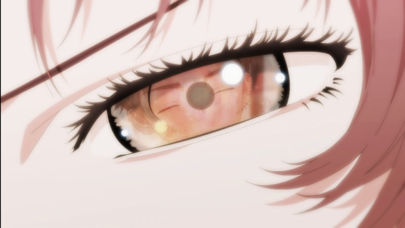
The physical aspect of the show, Mie’s physical presence close to Kaede – is the running joke and theme of the first episode. GoHands’ attention to detail on Mie gives the viewer an idea of how Kaede sees and experiences all of these events. The show maintains its attention to detail regarding background characters throughout the episode. I will refer to Sakugabooro one last time for another fun animation sequence:
Here, we have a 30 second sequence from gym class (the fact gym is co-ed is a sign we are in middle school). The first 3 seconds feature Mie dramatically gesturing as she prepares to play dodgeball. Because she does not have her glasses (Kaede blames himself for having made a certain wish the night before), Kaede worries about her and wonders why she is in gym class at all. There is an odd imagination sequence, but we return to Kaede jumping in front of Mie to protect her. Mie, seeing an opportunity, decides to hide behind Kaede (he immediately gets plunked but the clip cuts away first). This scene makes both Kaede and Mie look full of life, and if you pay attention to the students on the other side of the net at the start of the scene, you will see that they are all subtly reacting to the scene between Kaede and Mie.
Of course, the episode proper had some of the issues we saw in the unfortunate parts of the first three minutes. While the camera calmed down, the 3D asset quality was inconsistent. There were times, such as in previous two scenes I singled out for analysis, where the 3D assets were well done, fit with the backgrounds, and wherein the characters and assets looked like they were part of the same environment. However, there were scenes where 3D assets stuck out like a sore thumb – notably the backgrounds in most school hallway scenes were terrible (similarly bad to the final stretch of the opening sequence) – although an important mid-episode scene at the shoe lockers looked good.
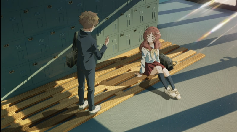
The lighting did not bother me like it bothered some viewers, but the overall quality was variable and far short of a lighting masterpiece like 5 Centimeters Per Second. I saw some complaints about dust particles being animated in the classroom, but I thought that aspect was well done and added a sense of realism to the scene.
Final animation assessment and looking ahead
I generally, more often than not, liked the animation of the first episode – especially to the extent that the important scenes featuring direct interactions between Kaede and Ai were well done, and at times (see two examples linked above) exceptionally so. I get the feeling that this series will live or die with the main character relationship – and insofar as many of the jokes play on their physical proximity to one another, detailed animation of both is crucial.
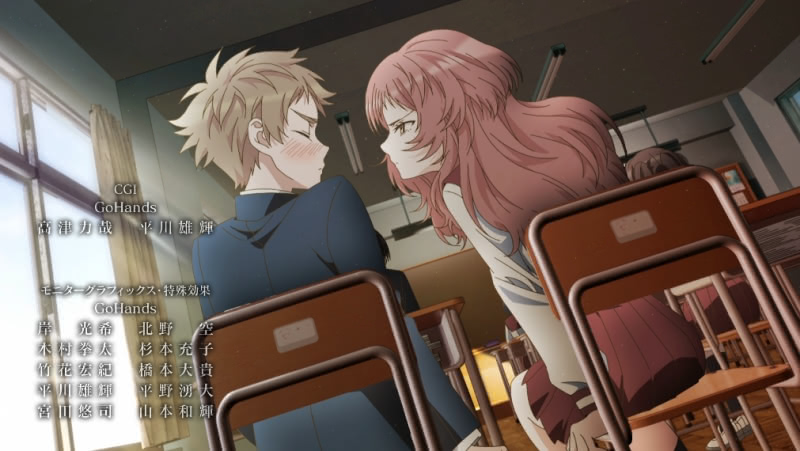
Moreover, assuming the series is seen from Kaede’s perspective, GoHands’ very physical animation style gives Ai the sort of presence needed to deliver the material. To this extent, I disagree with the negative reviews to the extent they suggest that GoHands does not understand the material. The episode proper, beyond the first three minutes, shows GoHands employing techniques in animating Kaede’s and Ai’s interactions in order to effectively deliver the central joke of the episode. The first three minutes were mostly showboating, but there was a legitimate plot development reason to the later brief dream sequence insofar as it gave viewers a portrait of how Ai Mie lappears to Kaede.
With that being said, there are obvious red flags with the lesser aspects of the first episode that are obvious even without a preexisting distaste for GoHands’ house style. I am concerned with the inconsistency in 3D assets – and in light of the fact that it seems clear significant time and effort went into the first episode, I am unsure whether I should expect this issue to improve. Just as a remarkably well-animated scene of Mie hopping on her chair to Kaede’s desk invites viewers into the scene, a poorly composited desk top or an excessively sharp, shiny, untextured corner of a hallway wall can jerk a viewer right out of the scene.
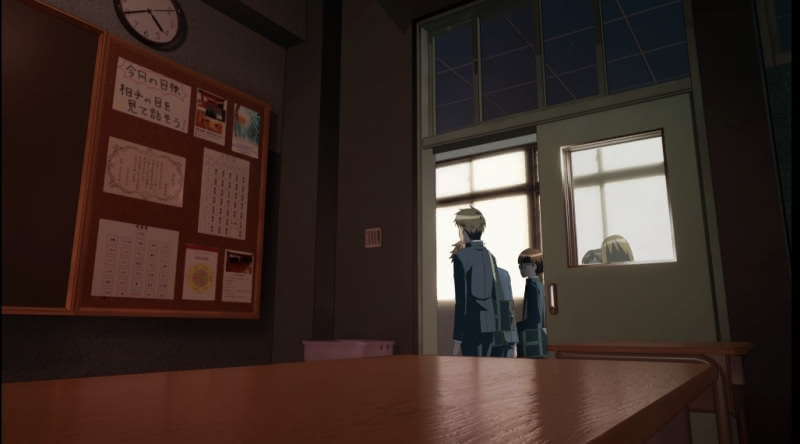
I would be more than happy to see GoHands trade the dramatic camera work for more consistency in 3D assets – and I would even accept some more filler images, provided they look good, as an alternative to the compositing issues. I am also disappointed in how the first episode handled shadows. I noted some issues with character shadows in the first instance, and shadows throughout the episode – even in its better moments – look blocky and unnatural. GoHands style – especially its interest in writing (sometimes well-applied, other times not) demands a better understanding of shadows and perspective. This should be a point of emphasis for the studio going forward.

Earlier this year, I wrote a comprehensive review of The Angel Next Door Spoils Me Rotten, a series which I assessed as a borderline yearly top-six sort of series. That series, which was very much a character drama, featured decent animation in its best moments and some total breakdowns in the middle episodes. Even at its best, there was nothing interesting about the animation (other than diverse wardrobes) and the series was carried entirely by its solid, albeit unspectacular, story.
I remain a bit skeptical of whether there is anything substantive to the plot of The Girl I Like Forgot Her Glasses. The first episode was decently pleasant (albeit we will need some explanation of how the chronically nearsighted Mie managed to forget her glasses – that she lives right by the school is not enough alone), but it generally took the whole episode to deliver its punchline. We still know little about Kaede other than that he likes Mie and little about Mie other than that she is a bit of a space cadet and has very poor eyesight.
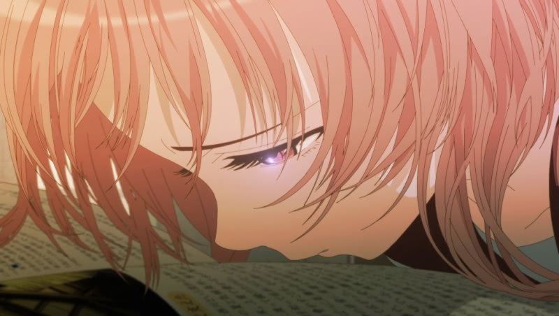
If GoHands can bring more consistency to upcoming episodes, I see some potential for this to be an unexpectedly solid production. At the very least, my initial impression is that the series has a much better chance with the dice roll that GoHands will consistently deliver some of the better work we saw in the first episode (as opposed to its lesser moments) than the sort of bland animation we saw in Angel Next Door and many series like it.
I will report back to readers in September when the series comes to a close.
Aside: GoHands’ other summer 2023 series
Remarkably, GoHands has a second anime series on its plate for summer 2023 – The Masterful Cat Is Depressed Again Today. That series is about an office lady who lives alone with her cat – but her cat happens to be eight feet tall and does her cooking and cleaning. I watched the first episode and while it had a similarly dramatic opening sequence to The Girl I Like Forgot Her Glasses, it was better done and the episode as a whole was more consistent and of slightly higher quality in animation and story-boarding. However, granting its generally higher quality and more consistent animation, it lacked a single stand-out scene unlike a couple of the scenes delivered in the first Glasses episode. (I am not sure whether my hopes for more consistency in either production will be undermined by the fact that the studio has two projects simultaneously.) There was enough there to continue, so I will see how both series develop.